Meter
This widget style encompasses a collection of components. The indicator and main label are primary by default, or the selected color. If provided, the subtext is secondary for light themes and light for dark themes. However, all of these elements can be configured using the available colors.
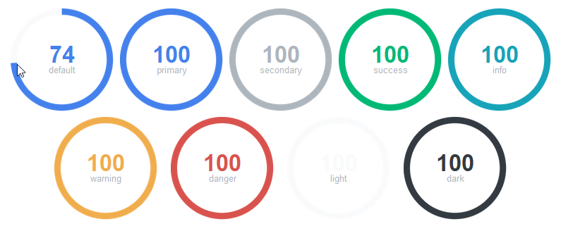
The meter widget is highly configurable, and can produce a diversity of interesting meters by mixing colors and other widget specific settings.
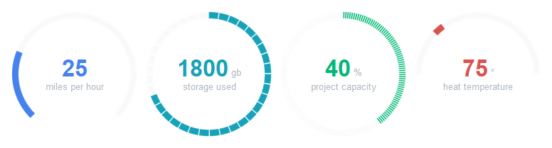
# default meter style
Meter()

# info colored meter
Meter(bootstyle="info")

# danger color subtext
Meter(subtextstyle="danger")

# success colored meter with warning colored subtext
Meter(bootstyle="success", subtextstyle="warning")