Scale
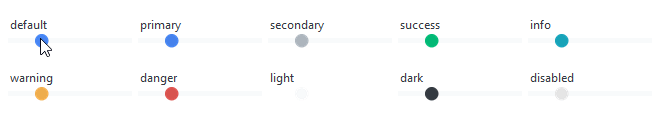
This widget style features a thin gray trough with a round slider handle that is primary color by default or the selected color. The slider handle lightens on hover and darkens when pressed.
This widget supports a special style for disabled state.
# default Scale style
Scale()

# info colored label style
Scale(bootstyle="info")
Other scale styles
Disabled scale
This style cannot be applied via keywords; it is configured through widget settings.
# create the scale in a disabled state
Scale(state="disabled")

# disable a scale after creation
scale = Scale()
scale.configure(state="disabled")