Scrollbar
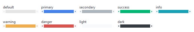
This widget style features a light gray trough with a styled thumb and arrow buttons. The thumb and arrows lighten on hover and darken on press. The thumb and arrows can be styled with any of the available colors.
Square (default)
The default style features a thumb with squared edges.
# default scrollbar style
Scrollbar()

# success colored default scrollbar style
Scrollbar(bootstyle="success")
Round
The round style features a thumb with rounded edges.

# default round scrollbar style
Scrollbar(bootstyle="round")

# danger colored round scrollbar style
Scrollbar(bootstyle="danger-round")