

OptionMenu#
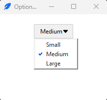
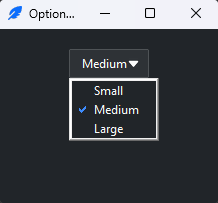
An option menu is a dropdown that picks one value from a fixed list, bound to
a variable — a compact alternative to a group of radiobuttons. OptionMenu is the native ttk.OptionMenu, styled with
bootstyle=. This page covers building one, reacting to a choice, then the
bootstyle color and states.
Usage#
Unlike a menubutton, an option menu builds its own menu from the values you pass. The constructor takes the parent, the bound variable, a default value, then the list of choices:
import ttkbootstrap as ttk

app = ttk.App()

size = ttk.StringVar()
ttk.OptionMenu(app, size, "Medium", "Small", "Medium", "Large").pack(padx=10, pady=10)

ttk.Button(app, text="Order", command=lambda: print(size.get()), bootstyle="primary").pack()

app.mainloop()
The second argument is the variable the selection is stored in; the third is the
value shown initially; the rest are the choices. Read the selection with the
variable’s .get(), and set it with .set().
Note
Include the default among the choices if you want it selectable again after the user picks something else — the default value is shown first but is not added to the list automatically.
Reacting to a choice#
Pass command= to run code when the user picks an item; it receives the chosen
value as its argument:
def on_choice(value):
    print("chose", value)

ttk.OptionMenu(app, size, "Medium", "Small", "Medium", "Large", command=on_choice)
Rebuilding the choices#
The choices are fixed at construction, but set_menu(default, *values) rebuilds
the list later — repopulate it when your data changes:
menu = ttk.OptionMenu(app, size, "Medium", "Small", "Medium", "Large")
menu.set_menu("Large", "Large", "X-Large")   # new default + new choices
Color#
bootstyle sets the button’s color from the semantic palette. Like a
menubutton, it also takes an outline variant for a
bordered button and a ghost variant that stays transparent until you hover
it — quiet enough for a toolbar:
ttk.OptionMenu(app, size, "Medium", "Small", "Medium", "Large", bootstyle="success")
ttk.OptionMenu(app, size, "Medium", "Small", "Medium", "Large", bootstyle="info outline")
ttk.OptionMenu(app, size, "Medium", "Small", "Medium", "Large", bootstyle="info ghost")
Across platforms
An option menu opens a native menu, so — like a menubutton — its dropdown follows the platform: on macOS a native pop-up anchored over the button, on Windows and Linux a themed drop-down list. The button itself is themed consistently everywhere.
States#
Toggle the disabled state to grey the control out and block it from opening:
option.state(["disabled"])          # greyed out, won't open
option.state(["!disabled"])         # re-enable
Reference#
OptionMenu is the native ttk.OptionMenu; ttkbootstrap adds only the
bootstyle keyword. Its constructor is
OptionMenu(master, variable, default, *values, command=None, direction="below"),
and set_menu(default, *values) rebuilds the choices.
OptionMenu API reference — every option and method.
OptionMenu styling options — an option menu renders as a menubutton, so it shares that customization surface, with the Custom styles guide.
See also
Menubutton — for a full menu (commands, separators, submenus).
Combobox — a version the user can also type into.
Radiobutton — the same choice as a visible group.