

Canvas#
A canvas is a 2-D drawing surface — you place lines, shapes, text, images, and
even other widgets on it, then move, restyle, and delete them individually.
Canvas is tkinter’s tk.Canvas; ttkbootstrap themes it to match the active
theme automatically (there is no bootstyle — its background follows the
theme). This page covers drawing items, the coordinate system, ids and tags, the
stacking order, state-driven styling, making items interactive, embedding text and
widgets, and scrolling a drawing larger than the window.
Usage#
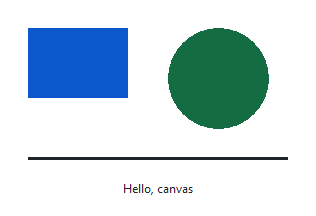
Create it with a width and height in pixels, then draw with the
create_* methods. Each takes the item’s coordinates first, then keyword
options like fill and outline:
import ttkbootstrap as ttk

app = ttk.App()

canvas = ttk.Canvas(app, width=300, height=200)
canvas.pack(padx=10, pady=10)

canvas.create_rectangle(20, 20, 120, 90, fill="#0d6efd", outline="")
canvas.create_oval(160, 20, 260, 120, fill="#20c997", outline="")
canvas.create_line(20, 150, 280, 150, width=3)
canvas.create_text(150, 180, text="Hello, canvas")

app.mainloop()
Each item is an independent object living on the canvas — nothing is “painted” permanently. You keep drawing, then reach back and change, move, or remove any item you drew.
The coordinate system#
Coordinates are measured from the top-left corner: x grows to the right,
y grows downward. Rectangles, ovals, and arcs are given by two opposite
corners of a bounding box; lines and polygons by a run of points:
canvas.create_rectangle(x0, y0, x1, y1)     # top-left and bottom-right corners
canvas.create_line(x0, y0, x1, y1, x2, y2)  # a path through several points
An oval fills the box you give it — pass a square box for a circle. Coordinates
are stored as floating-point numbers, and any distance may be written with a
unit suffix — "2c" (centimetres), "1i" (inch), "10m" (millimetres),
"72p" (points) — instead of bare pixels:
canvas.create_line("1c", "1c", "5c", "1c") # a 4 cm line
One quirk to know: querying a rectangle’s or oval’s coords returns them
normalised to left-top-right-bottom order (and always in pixels), which may
differ from the order you passed in.
Stacking order#
Items sit in a display list: earlier items are drawn first, later ones on top.
A new item always goes on top of everything drawn before it. Reorder with
tag_raise (bring to front) and tag_lower (send to back), and note that
find_all reports ids in this bottom-to-top order:
back = canvas.create_rectangle(20, 20, 120, 90, fill="#0d6efd", outline="")
front = canvas.create_oval(60, 40, 160, 120, fill="#ffc107", outline="")

canvas.tag_raise(back)     # the rectangle now covers the oval
canvas.tag_lower(back)     # ...and back behind it
Embedded widgets (Text, images, and widgets) are the exception — they always draw on top of the graphics, regardless of the display list.
Moving and changing items#
Once an item exists you rarely recreate it — you adjust it in place:
move(tagOrId, dx, dy)shifts matching items by an offset.coords(tagOrId, *new)sets an item’s coordinates outright, or returns them when called with just the id.itemconfigure(tagOrId, **options)changes any of the item’s options (fill,outline,width,text,state, …).delete(tagOrId)removes matching items;delete("all")clears the canvas.
ball = canvas.create_oval(20, 20, 60, 60, fill="#0d6efd", outline="")

canvas.move(ball, 40, 0)                  # nudge right
canvas.coords(ball, 100, 100, 160, 160)   # or reposition absolutely
x0, y0, x1, y1 = canvas.coords(ball)       # query the current box
States and state-driven styling#
Every item has a state — "normal", "hidden", or "disabled" —
which you set at creation or with itemconfigure. "hidden" removes it from
view without deleting it (great for toggling parts of a drawing on and off), and
"disabled" shows it but makes it ignore all bindings:
canvas.itemconfigure(ball, state="hidden")   # temporarily invisible
canvas.itemconfigure(ball, state="normal")   # back again
The canvas also gives items automatic hover styling with no binding at all.
Alongside fill/outline/width you can set active* variants that
apply while the pointer is over the item, and disabled* variants for the
disabled state. So a shape can light up on hover for free:
canvas.create_oval(
    50, 50, 110, 110,
    fill="#0d6efd", activefill="#dc3545",     # blue, red under the pointer
    outline="", width=2, activewidth=4,
)
activefill/activeoutline/activewidth/activedash/activestipple
(and the matching disabled* set) cover the common cases without a single event
handler.
Making items interactive#
Canvas items are not widgets — they can’t take focus, and bind is for the
canvas as a whole. To respond to events on a specific item, use tag_bind,
which fires for every item matching the tag or id. The callback receives an event
whose x/y are the pointer position:
dot = canvas.create_oval(50, 50, 90, 90, fill="#0d6efd", outline="", tags="target")

def flip_color(event):
    canvas.itemconfigure("target", fill="#dc3545")

canvas.tag_bind("target", "<Button-1>", flip_color)
Item bindings rely on the "current" tag (the topmost item under the pointer),
so <Enter> / <Leave> work per item, and closeenough (a canvas option,
default 1 pixel) sets how near counts as “over.” To drag an item, move it to
follow the pointer on <B1-Motion> — convert the event’s window coordinates to
canvas coordinates with canvasx/canvasy so it stays correct when the
canvas is scrolled:
handle = canvas.create_oval(40, 40, 80, 80, fill="#20c997", outline="", tags="drag")

def on_drag(event):
    x = canvas.canvasx(event.x)
    y = canvas.canvasy(event.y)
    canvas.coords("drag", x - 20, y - 20, x + 20, y + 20)

canvas.tag_bind("drag", "<B1-Motion>", on_drag)
Shapes and lines#
The shape items share fill, outline, and width, and each adds a few of
its own worth knowing:
Line (
create_line) —arrow("first"/"last"/"both") puts arrowheads on the ends,smooth=Truerenders it as a spline curve through the points,dashmakes it dashed, andcapstyle/joinstyleshape the ends and corners.Arc (
create_arc) —startandextent(both in degrees) set the slice, andstylepicks"pieslice"(default),"chord", or"arc"(just the curved edge).Polygon (
create_polygon) — closes the path automatically and cansmooth. Note a filled and an unfilled polygon both count as “solid” for hit-testing; use acreate_lineif you want a click-through outline.Rectangle and oval take only the shared options.
canvas.create_line(20, 20, 120, 20, arrow="last", width=2)
canvas.create_arc(20, 40, 120, 140, start=30, extent=120, style="pieslice", fill="#0d6efd")
canvas.create_polygon(60, 40, 100, 100, 20, 100, fill="#20c997", outline="")
Text, images, and widgets#
Beyond shapes, a canvas can hold text, images, and live widgets — each positioned
at a point, with anchor deciding which part of the item sits on that point
("nw" for the top-left, "center" by default):
canvas.create_text(20, 20, text="Top-left label", anchor="nw", justify="left")

logo = ttk.PhotoImage(file="logo.png")
canvas.create_image(150, 100, image=logo)      # keep a reference to `logo`

button = ttk.Button(app, text="Click me")
canvas.create_window(150, 170, window=button)
A few specifics:
Text (
create_text) — setwidth(pixels) to wrap long text at word boundaries,justifyto align the wrapped lines, andangleto rotate the text. Text items are editable and support the character indices"insert"/"end"withinsertanddchars.Image (
create_image) — needs a live reference to thePhotoImage; if it is garbage-collected the picture vanishes, so store it (e.g. onself).Window (
create_window) — embeds any existing widget (not a toplevel). Embedded widgets always draw on top of the graphics and are clipped by the parent window, not the canvas border.
Scrolling#
A canvas can be larger than the window it shows. Set scrollregion to the full
drawing area — (left, top, right, bottom) in canvas coordinates — and wire a
Scrollbar to it, exactly as you would for a Text or Treeview:
canvas = ttk.Canvas(app, width=300, height=200)
vbar = ttk.Scrollbar(app, orient="vertical", command=canvas.yview)
canvas.configure(yscrollcommand=vbar.set)

canvas.pack(side="left", fill="both", expand=True)
vbar.pack(side="right", fill="y")

canvas.create_line(0, 0, 300, 1000, width=2)   # a tall drawing
canvas.configure(scrollregion=canvas.bbox("all"))
bbox("all") returns the box enclosing every item, so setting scrollregion
to it is the usual way to make the whole drawing reachable. confine=True (the
default) keeps the view inside that region, and xscrollincrement /
yscrollincrement quantise scrolling to a fixed step. For a quick “grab and
pan” gesture, wire scan_mark / scan_dragto to a mouse button:
canvas.bind("<Button-1>", lambda e: canvas.scan_mark(e.x, e.y))
canvas.bind("<B1-Motion>", lambda e: canvas.scan_dragto(e.x, e.y, gain=1))
For a ready-made scrollable region that holds ordinary widgets rather than drawn
items, use ScrolledFrame — see
Scroll long content.
Appearance#
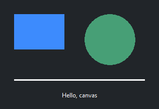
The canvas picks up the theme’s background automatically and re-themes when you
switch themes — you don’t style it with bootstyle. Items carry their own
colors through their fill/outline options, so a drawing’s palette is up to
you; pull theme colors from the Style if you want them
to track the theme:
colors = app.style.colors
canvas.create_rectangle(20, 20, 120, 90, fill=colors.primary, outline="")
To keep tkinter’s default look and take over styling entirely, pass
autostyle=False — it opts out of the automatic theming:
ttk.Canvas(app, autostyle=False, background="white")
Reference#
Canvas is tkinter’s tk.Canvas; ttkbootstrap themes it but adds no Python
API beyond autostyle. The standard library doesn’t document it in full.
Canvas reference — its options and methods (item constructors, geometry, tagging, stacking, scrolling).
Tk canvas manual page — the canonical upstream reference (Tcl 8.6; a subcommand like
itemconfiguremaps to the Python method of the same name).
See also
Text — the other big tk-native widget.
Scroll long content — scrollable regions built from ordinary widgets.