Collapsing Frame
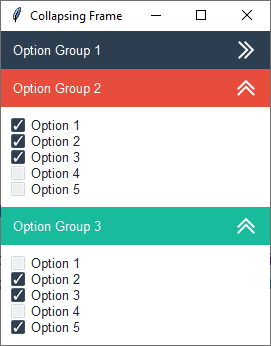
This example demonstrates how to build a collapsing frame widget. Each frame added to the widget can be assigned a title and style. The overall theme is flatly and various widget styles are applied to distinguish the option groups.
- option group 1
primary.TFrame- option group 2
danger.TFrame- option group 3
success.TFrame
The collapse functionality is created by removing contents of the child frame and then adding it again with the grid
manager. The toggle checks to see if the contents is visible on the screen, and if not, will add the contents back with
the grid manager, otherwise, it will all be removed. This is all done in the _toggle_open_close method. Additionally
the button image alternates from open to closed to give a visual hint about the child frame state.
A style argument can be passed into the widget constructor to change the widget header color. The constructor extracts
the color from the style class and applies it internally to color the header, using a label class for the title, and a
button class for the button. The primary.Invert.TLabel class inverts the foreground and background colors of the
standard primary.TLabel style so that the background shows the primary color, similar to a button.
Run this code live on repl.it
"""
    Author: Israel Dryer
    Modified: 2021-04-08
"""
import tkinter
from tkinter import ttk
from pathlib import Path

from ttkbootstrap import Style


class Application(tkinter.Tk):

    def __init__(self):
        super().__init__()
        self.title('Collapsing Frame')
        self.style = Style()

        cf = CollapsingFrame(self)
        cf.pack(fill='both')

        # option group 1
        group1 = ttk.Frame(cf, padding=10)
        for x in range(5):
            ttk.Checkbutton(group1, text=f'Option {x + 1}').pack(fill='x')
        cf.add(group1, title='Option Group 1', style='primary.TButton')

        # option group 2
        group2 = ttk.Frame(cf, padding=10)
        for x in range(5):
            ttk.Checkbutton(group2, text=f'Option {x + 1}').pack(fill='x')
        cf.add(group2, title='Option Group 2', style='danger.TButton')

        # option group 3
        group3 = ttk.Frame(cf, padding=10)
        for x in range(5):
            ttk.Checkbutton(group3, text=f'Option {x + 1}').pack(fill='x')
        cf.add(group3, title='Option Group 3', style='success.TButton')


class CollapsingFrame(ttk.Frame):
    """
    A collapsible frame widget that opens and closes with a button click.
    """

    def __init__(self, *args, **kwargs):
        super().__init__(*args, **kwargs)
        self.columnconfigure(0, weight=1)
        self.cumulative_rows = 0
        p = Path(__file__).parent
        self.images = [tkinter.PhotoImage(name='open', file=p/'assets/icons8_double_up_24px.png'),
                       tkinter.PhotoImage(name='closed', file=p/'assets/icons8_double_right_24px.png')]

    def add(self, child, title="", style='primary.TButton', **kwargs):
        """Add a child to the collapsible frame

        :param ttk.Frame child: the child frame to add to the widget
        :param str title: the title appearing on the collapsible section header
        :param str style: the ttk style to apply to the collapsible section header
        """
        if child.winfo_class() != 'TFrame':  # must be a frame
            return
        style_color = style.split('.')[0]
        frm = ttk.Frame(self, style=f'{style_color}.TFrame')
        frm.grid(row=self.cumulative_rows, column=0, sticky='ew')

        # header title
        lbl = ttk.Label(frm, text=title, style=f'{style_color}.Invert.TLabel')
        if kwargs.get('textvariable'):
            lbl.configure(textvariable=kwargs.get('textvariable'))
        lbl.pack(side='left', fill='both', padx=10)

        # header toggle button
        btn = ttk.Button(frm, image='open', style=style, command=lambda c=child: self._toggle_open_close(child))
        btn.pack(side='right')

        # assign toggle button to child so that it's accesible when toggling (need to change image)
        child.btn = btn
        child.grid(row=self.cumulative_rows + 1, column=0, sticky='news')

        # increment the row assignment
        self.cumulative_rows += 2

    def _toggle_open_close(self, child):
        """
        Open or close the section and change the toggle button image accordingly

        :param ttk.Frame child: the child element to add or remove from grid manager
        """
        if child.winfo_viewable():
            child.grid_remove()
            child.btn.configure(image='closed')
        else:
            child.grid()
            child.btn.configure(image='open')


if __name__ == '__main__':
    Application().mainloop()