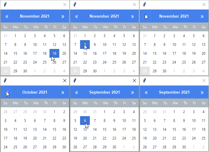
DatePickerPopup
This widget style encomposses a collection of button and label widgets. The
header and active date are primary colored (default) or the
selected color. The weekdays header and current date use the
secondary color.
Check out the api documentation for more information on how to use this widget.

# default popup
DatePickerPopup()

# warning colored popup
DatePickerPopup(bootstyle="warning")