Menubutton
This widget features a styled button with an arrow that can be styled using any of the available colors.
This widget supports a special style for disabled state.
Solid (default)
This widget style features a solid background color that lightens on hover and darkens when pressed.
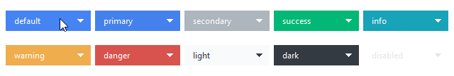
# default solid menubutton style
Menubutton()

# success colored solid menubutton style
Menubutton(bootstyle="success")
Outline
This style features a thin styled outline. When pressed or on hover, the button changes to a solid color similar to the default menubutton style.
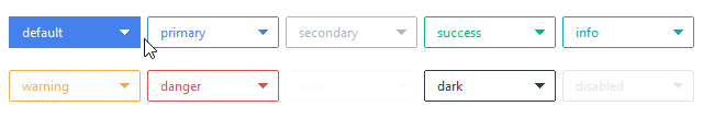
# default outline menubutton style
Menubutton(bootstyle="outline")

# info colored outline menubutton style
Menubutton(bootstyle="info-outline")
Other menubutton styles
Disabled menubutton
This style cannot be applied via keywords; it is configured through widget settings.
# create the menubutton in a disabled state
Menubutton(state="disabled")

# disable a menubutton after creation
b = Menubutton()
b.configure(state="disabled")