Checkbutton
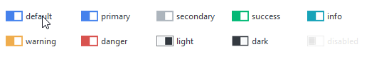
This widget features a variety of checkbutton style types that are primary colored by default or the selected color.
This widget supports a special style for disabled state.
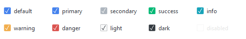
Checkbutton (default)
The default style features a square checkbox and label. The checkbox has a muted color outline when not selected, and a filled square with checkmark when selected.
# default checkbutton style
Checkbutton()

# success checkbutton style
Checkbutton(bootstyle="success")
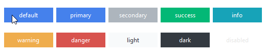
Toolbutton
This style features a solid rectangular button that toggles between an off and on color. The background is a muted gray when off and a default or selected color when on or active.
# default toolbutton style
Checkbutton(bootstyle="toolbutton")

# success toolbutton style
Checkbutton(bootstyle="success-toolbutton")
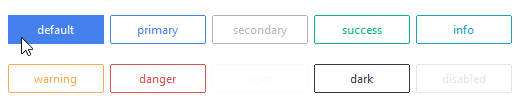
Outline toolbutton
This style features a rectangular button that toggles between a styled outline when off and a solid background when on or active.
# default outline toolbutton style
Checkbutton(bootstyle="outline-toolbutton")

# success outline toolbutton style
Checkbutton(bootstyle="success-outline-toolbutton")
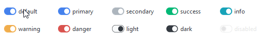
Round toggle button
This style features a rounded button with a round indicator that changes color and position when toggled off and on. The button is a muted outline with a muted color indicator when off. The button is filled with the default or selected color with an accented indicator when on.
# default round toggle style
Checkbutton(bootstyle="round-toggle")

# success round toggle style
Checkbutton(bootstyle="success-round-toggle")
Square toggle button
This style features a squared button with a square indicator that changes color and position when toggled off and on. The button is a muted outline with a muted color indicator when off. The button is filled with the default or selected color with an accented indicator when on.
# default square toggle style
Checkbutton(bootstyle="square-toggle")

# success square toggle style
Checkbutton(bootstyle="success-square-toggle")
Other checkbutton styles
Disabled checkbutton
This style cannot be applied via keywords; it is configured through widget settings.
# create the checkbutton in a disabled state
Checkbutton(state="disabled")

# disable a checkbutton after creation
cb = Checkbutton()
cb.configure(state="disabled")