Progressbar
This widget features a few style types that have primary colored indicator bars by default, but can by styled using any of the available colors.
Solid (default)
The default widget style features a solid color indicator bar.
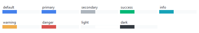
# default solid progressbar style
Progressbar()

# success colored solid progressbar style
Progressbar(bootstyle="success")
Striped
This widget style features a striped indicator bar that uses the default or selected color for the main color, and a desaturated version of this color for the alternating stripe.
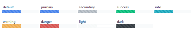
# default striped progressbar style
Progressbar(bootstyle="striped")

# danger colored striped progressbar style
Progressbar(bootstyle="danger-striped")