Entry
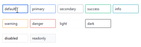
This widget style features a input box with a styled border. The border color is muted by default and changes to primary or the selected color on hover. The border increases in thickness on focus.
This widget also supports special styles for disabled state, readonly state, and invalid state.
# default entry style
Entry()

# danger colored entry style
Entry(bootstyle="danger")
Other entry styles
Disabled entry
This style cannot be applied via keywords; it is configured through widget settings.
# create the widget in a disabled state
Entry(state="disabled")

# disable the widget after creation
e = Entry()
e.configure(state="disabled")
Readonly entry
This style cannot be applied via keywords; it is configured through widget settings.
# create the widget in a readonly state
Entry(state="readonly")

# set the widget readonly state after creation
e = Entry()
e.configure(state="readonly")
Invalid entry
This style cannot be applied via keywords, but rather is the result of a
validation process implemented on the widget. In the Cookbook you will find
an example of how to apply validation to an
Entry based widget.