

Icons#
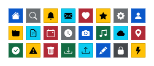
ttkbootstrap ships the full Bootstrap Icons
set — over 2,000 glyphs — rendered from a bundled font, not raster files. Because
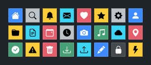
they are drawn on demand, icons are crisp at any size and follow the theme:
a glyph recolors when you switch themes, inverts on an outline button, and
mutes when the widget is disabled. No extra dependency, no image files to ship.
Adding an icon to a widget#
The easy way is the icon= keyword — pass a glyph name and ttkbootstrap does
the rest:
ttk.Button(app, text="Settings", icon="gear-fill", bootstyle="primary")
The glyph sits to the left of the text and takes its color from the widget’s style, so you never pick the color yourself — it stays correct across every theme and widget state.
icon= is available on the widgets that carry a label image:
Button(includingoutline,toolbutton,link, andghostvariants)LabelMenubuttonCheckbuttonandRadiobutton
Note
Treeview and Notebook show images through their own per-item options
(Treeview cell/heading images, notebook tab image=), not through
icon=. For those, build a standalone image with Icon() (below) and
pass it to the per-item API.
Sizing and icon-only controls#
icon_size= sets the glyph size in logical pixels (an int, or a
(width, height) pair); it is scaled for high-DPI displays automatically:
ttk.Label(app, text="Home", icon="house-fill", icon_size=24)
icon_only=True drops the text and gives the widget symmetric padding, making
it a square button the same height as a normal one — the shape you want for a
toolbar:
ttk.Button(app, icon="trash-fill", icon_only=True, bootstyle="danger")
Changing or removing an icon#
icon is a normal configurable option: set a new glyph, or pass None to
clear it, through configure after the widget exists:
btn.configure(icon="check-lg")     # swap the glyph
btn.configure(icon=None)           # remove it, restore the plain style
Per-state glyphs#
An icon’s color already follows the widget state. To show a different glyph
per state — the classic empty-vs-checked box — use apply_icon() with a
states map. Each key is a ttk state string; the default name applies when no
mapped state is active:
cb = ttk.Checkbutton(app, text="Subscribe")
ttk.apply_icon(cb, "square", states={"selected": "check-square-fill"})
The state strings are ordinary ttk state specs ("disabled",
"pressed !disabled", …), the same grammar the style engine uses.
apply_icon: the imperative form#
icon= is sugar over apply_icon(), which you can also call directly on a
widget you already have. It exposes the extra options icon= doesn’t —
states= (above) and compound= (where the glyph sits relative to the
text):
ttk.apply_icon(btn, "box-arrow-right", compound="right")
Passing None (or "") as the name clears the icon, exactly like
configure(icon=None). A widget class that has no label image (an Entry,
say) raises TypeError.
A standalone image with Icon#
When you need a plain Tk image — for a Treeview row, a notebook tab, or any
image= slot — build one with Icon(). It returns a cached image you can
hand to any widget:
gear = ttk.Icon("gear-fill", size=20, color="primary")
ttk.Button(app, text="Settings", image=gear, compound="left")
color takes a bootstyle keyword ("primary", "success", "fg", …)
resolved against the current theme, or a plain "#rrggbb" string. Identical
(name, size, color) calls return the same cached image.
Important
Unlike icon=/apply_icon(), an Icon() image is a static
snapshot — a fixed color baked at the size you asked for. It does not track
the widget’s state or recolor on a theme switch. Reach for it when you need a
raw image handle; reach for icon= for a widget that should stay in sync
with the theme.
Finding glyph names#
Names are exactly the Bootstrap Icons
names — browse the site, and use the name under each glyph (gear-fill,
check-square-fill, box-arrow-right). An unknown name raises
ValueError. Many glyphs come in an outline and a -fill pair; the filled
variants read better at small sizes.
Advanced
To place a glyph inside a style layout you author yourself (a custom
indicator, say), use icon_element, which builds a ttk image element whose
per-state image is a glyph. This works directly with ttk’s element and layout
model; see Custom styles for the style-construction
toolkit, and the tkinter.ttk styling reference
for the underlying concepts.
A worked example#
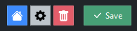
A small toolbar of icon-only buttons beside a labeled action:
import ttkbootstrap as ttk

app = ttk.App(title="Icons")

bar = ttk.Frame(app, padding=10)
bar.pack()

for name, style in [("house-fill", "primary"),
                    ("gear-fill", "secondary"),
                    ("trash-fill", "danger")]:
    ttk.Button(bar, icon=name, icon_only=True, bootstyle=style).pack(
        side="left", padx=2)

ttk.Button(bar, text="Save", icon="check-lg", bootstyle="success").pack(
    side="left", padx=(12, 0))

app.mainloop()

Other icon sets#
The bundled font is Bootstrap Icons. If you need another family — Font Awesome, Material, Ionicons, Lucide, and more — the optional ttkbootstrap-icons extension adds installable icon providers for your tkinter/ttkbootstrap app, alongside the built-in set described here.
See also
Imaging — the
Icon/apply_icon/icon_elementreference.Windows — the application (window/taskbar) icon.
Show images and icons — raster images and Pillow.