

Theming & Colors#
A theme decides what every bootstyle color actually renders as. Each
theme is built from a small set of semantic anchors — the accent colors
(primary, success, info, warning, danger) plus a neutral gray
— resolved against a light or dark surface. Pick a theme and the whole interface,
including your bootstyle widgets, recolors coherently. This guide covers
choosing and switching themes, reading the concrete colors a theme resolves to so
your own drawing tracks it, and building your own theme.
Choosing a theme#
Pass theme= to the app. The default is bootstrap-light:
import ttkbootstrap as ttk

app = ttk.App(theme="nord-light")

ttk.Button(app, text="Primary", bootstyle="primary").pack()

app.mainloop()
Note
themename= also works as an alias for theme= (the pre-2.0 spelling).
Switching at runtime#
Switch themes on a live app — every mounted widget repaints:
app.theme_use("solarized-dark")   # switch
app.theme_use()                   # -> the current theme name
app.theme_names()                 # -> every registered theme name
Light and dark#
Built-in themes come in <family>-light / <family>-dark pairs, so a family
has a matched light and dark surface. Flip between them without naming the
counterpart:
app.theme_mode          # "light" or "dark"
app.toggle_theme()      # flip light <-> dark within the family, returns the new mode
app.theme_mode = "dark" # or switch explicitly
A toggle button is the common case:
import ttkbootstrap as ttk

app = ttk.App(theme="nord-light")

ttk.Button(app, text="Toggle theme",
           command=app.toggle_theme, bootstyle="primary").pack()

app.mainloop()
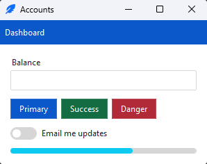
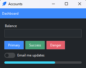
To pair themes from different families (say a light theme with an unrelated dark
one), set the pair explicitly with app.set_theme_modes(light=..., dark=...) or
App(light_theme=..., dark_theme=...).
The built-in catalog#
ttkbootstrap ships 15 theme families — bootstrap, pydata, nord,
solarized, catppuccin, gruvbox, dracula, tokyo-night, one,
everforest, vapor, minty, pulse, united, sandstone — each
with a light and dark variant, for 30 built-in themes. List them live with
app.theme_names().
Browse every one — a sample card per family, in light and dark — in the Themes catalog.
Coming from 1.x
The pre-2.0 Bootswatch theme names ("darkly", "cosmo", …) are no longer
registered by default. Call install_legacy_themes() to
register them all (it warns, and they are removed in 3.0), or just name one —
App(themename="darkly") lazily registers that single theme with a warning.
The five names that carried over into the curated catalog above — minty,
pulse, sandstone, united, vapor — instead resolve to their
curated variant at the 1.x theme’s own light/dark mode (vapor →
vapor-dark), with no warning.
Reading theme colors#
The active theme resolves its palette to concrete hex values, exposed through
app.style.colors. Read those whenever you draw your own content — a
Canvas, a custom style, a chart — so it tracks the theme instead of
hard-coding hex.
style.colors gives attribute access to the theme’s colors: the accents
(primary, secondary, success, info, warning, danger,
light, dark) and the interface roles (bg, fg, selectbg,
selectfg, border, inputbg, inputfg, active):
c = app.style.colors

canvas = ttk.Canvas(app, width=200, height=80, highlightthickness=0)
canvas.create_rectangle(10, 10, 190, 70, fill=c.success, outline=c.border)
canvas.pack()
Each value is an ordinary hex string, so it drops into any tkinter color option.
c.get(name) looks a color up by name and returns None if it isn’t one —
handy when the name is dynamic. These are snapshots of the current theme, so
keep custom drawing on-theme by re-reading them after a switch: register a
callback with on_theme_change() (or the @theme_aware
decorator), or bind the raw <<ThemeChanged>> event — see
Custom styles and
Events.
Color ramps#
Every color is also a ramp: index it with a stop from 50 (lightest) to
950 (darkest) to get a tint or shade, with the color itself as the 500
anchor. This is how you get an on-theme lighter or darker variant without color
math:
c.primary            # the theme's primary accent (also c.primary[500])
c.primary[300]       # a lighter tint
c.primary[700]       # a darker shade
c.ramp("primary")    # the whole 50–950 ramp as a mapping
Because a ramp color is just a string, c.primary still behaves exactly like
its hex value everywhere else.
Deriving colors#
For adjustments the ramp doesn’t cover, the color utilities are exported at the top level:
from ttkbootstrap import contrast_color, update_hsl_value, color_to_rgb

contrast_color(c.primary, model="hex")          # "#000"/"#fff" — readable text over a fill
update_hsl_value(c.primary, lum=70, inmodel="hex", outmodel="hex")  # lighten
color_to_rgb(c.primary, "hex")                  # the primary as an (r, g, b) tuple
To simulate a translucent fill over a known background, blend it with
make_transparent:
c.make_transparent(0.2, c.primary, c.bg) # 20% primary over the window bg
Coming from 1.x
The color helpers moved to ttkbootstrap.utils (and the top level). The old
ttkbootstrap.colorutils import still works but warns and is removed in 3.0.
Building your own theme#
Each theme is a semantic-anchor Theme — a family described
by its accent anchors and its light/dark surfaces, from which ttkbootstrap derives
the full color set (borders, inputs, selections, hovers) for each mode. Declare
those anchors and register the theme to add your own.
Defining a theme#
Build a Theme from its anchors and register it. The five
accents are the mid-tone of each color; light/dark each give a background
and foreground. Registration needs a running app (a style must exist first):
import ttkbootstrap as ttk

app = ttk.App()

ttk.Theme(
    name="brand",
    primary="#593196", success="#13b955", info="#009cdc",
    warning="#efa31d", danger="#fc3939",
    light=dict(background="#ffffff", foreground="#17141f"),
    dark=dict(background="#17141f", foreground="#e9ecef"),
).register()

app.theme_use("brand-light")   # registered as brand-light and brand-dark
app.mainloop()
Registering a theme generates a <name>-light and <name>-dark variant for
whichever surfaces you declared, so it drops straight into the light/dark
switching above — app.toggle_theme() flips brand-light ↔ brand-dark.
Re-branding a built-in#
To change just a color or two on an existing theme, derive from it with
Theme.from_existing and override the anchors you care about:
from ttkbootstrap.themes.builtin import BOOTSTRAP

ttk.Theme.from_existing(BOOTSTRAP, name="brand", primary="#ff6600").register()
app.theme_use("brand-light")
The visual editor#
To design a theme interactively rather than by hand, run the bundled editor:
python -m ttkcreator
Edit the accent anchors and the light/dark surfaces, preview against live
widgets, then Export theme (.py) – you get a Theme(...).register()
snippet (the same shape as above) to drop into your app. The editor doesn’t
save into the library; your theme lives in your own code.