

Styling with bootstyle#
Every ttkbootstrap widget is styled through one keyword: bootstyle. You give
it a short string that names intent — a color, a variant, a surface — and the
theme renders it correctly in light and dark without hard-coding a single hex
value. This guide covers everything that string can express.
import ttkbootstrap as ttk

app = ttk.App()

ttk.Button(app, text="Save",   bootstyle="success").pack()
ttk.Button(app, text="Cancel", bootstyle="secondary outline").pack()
ttk.Button(app, text="Delete", bootstyle="danger ghost").pack()

app.mainloop()
The slots#
A bootstyle value is a single string of space-separated tokens in a fixed
slot order:
[@surface] [color] [variant] <base-type> [orient]
@surface — the surface the control sits on, a mode-aware elevation scale
@chrome(recessive app framing) →@card(a raised panel), or an accent (@primary…), so a ghost, outline, or link control blends on a card or an accent bar instead of only the window background. A container frame can take the same token to become that surface —ttk.Frame(app, bootstyle="@card")is a sidebar or panel on the scale. Optional and position-free.color — the semantic intent:
primary,secondary,success,info,warning,danger,light,dark,neutral.variant — a look such as
outline,link,ghost,round,striped.base-type — the widget family. Usually inferred from the widget, so you leave it out; you spell it only for the chameleon families
toggle/toolbutton(see below).orient —
horizontal/vertical, inferred from the widget where it applies.
Every slot is optional. A bare widget with no bootstyle takes the theme’s
default look — for the button family (Button, Menubutton, and the
toolbutton variant) that default is neutral, a quiet no-accent fill;
other widgets use their standard theme style. Each token you add refines it.
Building up a style#
Start with a color — the widget picks the right shape from its own class:
ttk.Button(app, text="Go", bootstyle="primary")
ttk.Label(app, text="Heads up", bootstyle="warning")
ttk.Progressbar(app, bootstyle="success")   # orient inferred → horizontal


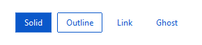
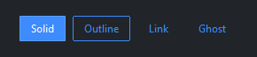
Add a variant to change visual weight. The color still leads:
ttk.Button(app, text="Solid",   bootstyle="primary")
ttk.Button(app, text="Outline", bootstyle="primary outline")
ttk.Button(app, text="Link",    bootstyle="primary link")
ttk.Button(app, text="Ghost",   bootstyle="primary ghost")
You can drop the color as well — with no color token, every button-family
variant keeps the quiet neutral look:
ttk.Button(app, text="Outline", bootstyle="outline") # neutral outline
Point a control at a surface with an @ token so it blends with what it
sits on:
card = ttk.Frame(app, bootstyle="@card", padding=12)   # the frame IS the card surface
ttk.Button(card, text="More", bootstyle="@card primary ghost")
The token exists because tkinter has no transparency. Where a control seems to
let the surface show through — the fill of a ghost, outline, or link button, the
label background of a checkbutton or radiobutton — the widget is really painted
a solid color, and by default that color is the window background. Sitting on a
card or an accent bar, that shows up as a wrong-colored box around the control.
@chrome or @card (the neutral elevation scale) or an accent
(@primary …) names the surface instead, and the theme paints the control to
match it. A container frame can take the same token to render as that surface,
so a control and the panel beneath it agree.
Chameleon base-types#
Two variants aren’t tied to one widget class, so you name the base-type
explicitly. toggle turns a Checkbutton into a switch; toolbutton
turns a Button (or Checkbutton) into a pressed-state toolbar button:
ttk.Checkbutton(app, text="Wi-Fi", bootstyle="success round toggle")
ttk.Checkbutton(app, text="Bold",  bootstyle="toolbutton")
How it resolves#
bootstyle is a compact spelling of the underlying ttk style name. The
tokens map onto the dotted name ttk actually uses:
|
ttk style name |
|---|---|
|
|
|
|
|
|
Because of that, bootstyle="primary outline" and the raw
style="primary.Outline.TButton" are interchangeable — bootstyle just
saves you from spelling the base-type, orientation, and casing. The full mapping
for each widget is in the Bootstyle mapping table of its
widget reference page.
Tokens are order-free and separator-flexible: "outline primary" and
"primary-outline" resolve the same as "primary outline". Spaces are the
recommended spelling — they read best and are what editor autocomplete suggests.
When a token is wrong#
The parser is a tokenizer over a closed vocabulary, so a typo doesn’t silently produce the wrong style — it fails loudly. By default an unknown token warns (and suggests the nearest match) and the widget falls back to a valid style:
ttk.Button(app, bootstyle="primatry") # UserWarning: did you mean 'primary'?
To make unknown tokens raise instead — useful in tests and CI — turn on strict mode, globally or per environment:
from ttkbootstrap import set_bootstyle_strict

set_bootstyle_strict(True)               # or set TTKBOOTSTRAP_STRICT=1
Note that ttkbootstrap is permissive about valid choices: a control on its own matching accent surface may render low-contrast, but that is a real style, so it is allowed — only misspelled or unknown tokens fail.
Beyond the grammar#
When you need a look the grammar can’t name — a bespoke color, a custom element
layout — you register your own ttk style and apply it with style=. See
Custom styles.
The rest of this page is the full vocabulary and every registered widget family, generated from the closed vocabulary and the builder registry.
Colors#
The color slot accepts any of the semantic colors: primary, secondary, success, info, warning, danger, light, dark, neutral.
Surfaces#
The optional @<surface> slot names the surface a control sits on so it can blend on a card or an accent bar. It accepts:
@chrome, @card, @primary, @secondary, @success, @info, @warning, @danger, @light, @dark.
Widget families and variants#
Every registered widget family and its variants. The base-type is
normally inferred from the widget and only spelled for the chameleon
families toggle / toolbutton.
Widget family |
Variant |
Example |
|---|---|---|
|
default |
|
|
default |
|
|
default |
|
|
default |
|
|
default |
|
|
default |
|
|
default |
|
|
default |
|
|
default |
|
|
default |
|
|
default |
|
|
default |
|
|
default |
|
|
default |
|
|
default |
|
|
default |
|
|
default |
|
|
default |
|
|
default |
|
|
default |
|
|
default |
|
|
default |
|
|
ghost |
|
|
ghost |
|
|
ghost |
|
|
link |
|
|
outline |
|
|
outline |
|
|
outline |
|
|
round |
|
|
round |
|
|
square |
|
|
striped |
|
|
thin |
|
|
thin |
|