

Layout with pack#
pack stacks widgets one after another against a side of their container. It’s
simpler than grid and ideal for
one-direction layouts — a toolbar, a column of buttons, or a content area sitting
above a status bar. We’ll build a small window shell to learn it.
Step 1 — stack against a side#
Each pack call places a widget against a side of the space left in the
container. The default side is "top", so calls stack downward:
import ttkbootstrap as ttk

app = ttk.App(title="Pack")

ttk.Button(app, text="One").pack()
ttk.Button(app, text="Two").pack()      # sits below One

app.mainloop()
Switch the side to "left" and the same calls build a row instead — the basis
of a toolbar:
ttk.Button(app, text="New").pack(side="left")
ttk.Button(app, text="Open").pack(side="left")     # to the right of New
Step 2 — span the container with fill#
Put those toolbar buttons in their own frame and pack it at the top. By default
the frame is only as tall and as wide as its buttons, so it doesn’t reach across
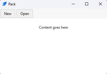
the window. fill="x" stretches it to the container’s full width:
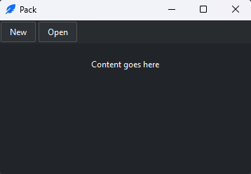
toolbar = ttk.Frame(app, bootstyle="@chrome")
toolbar.pack(side="top", fill="x")        # span the width, hug the top

ttk.Button(toolbar, text="New").pack(side="left", padx=2, pady=2)
ttk.Button(toolbar, text="Open").pack(side="left", padx=2, pady=2)
fill takes "x", "y", or "both" — it stretches the widget to fill
the space reserved for it along that axis.
Step 3 — claim the leftover space with expand#
Now add a content area below the toolbar. You want it to take all the remaining
room. fill alone won’t do that — it stretches a widget within its reserved
space, but the space reserved for the content is still only as tall as the content
needs. expand=True is the missing piece: it hands the widget the container’s
leftover space:
content = ttk.Frame(app, padding=20)
content.pack(side="top", fill="both", expand=True)   # take everything left over
ttk.Label(content, text="Content goes here").pack()
That’s the distinction worth remembering:
The other options: anchor positions a widget within its space when it isn’t
filling (anchor="w" left-aligns), padx/pady add space outside it, and
ipadx/ipady inside it — Spacing on the
Arranging widgets page maps the spacing layers. See the Pack reference.
Step 4 — combine managers by nesting frames#
Real windows aren’t one flat stack — they’re frames inside frames, each using whichever manager fits that region. This is the core technique. Here is a complete app shell: a toolbar and status bar hugging the top and bottom, and a middle row with a fixed sidebar beside a content area that fills the rest.
import ttkbootstrap as ttk

app = ttk.App(title="App shell", size=(600, 400))

ttk.Label(app, text="  My App", bootstyle="@primary").pack(
    side="top", fill="x", ipady=8)
ttk.Label(app, text="  Ready", bootstyle="@chrome").pack(
    side="bottom", fill="x", ipady=4)

middle = ttk.Frame(app)
middle.pack(side="top", fill="both", expand=True)

sidebar = ttk.Frame(middle, width=160, bootstyle="@card")
sidebar.pack(side="left", fill="y")
sidebar.pack_propagate(False)          # keep the fixed width

content = ttk.Frame(middle, padding=20)
content.pack(side="left", fill="both", expand=True)
ttk.Label(content, text="Content goes here").pack()

app.mainloop()
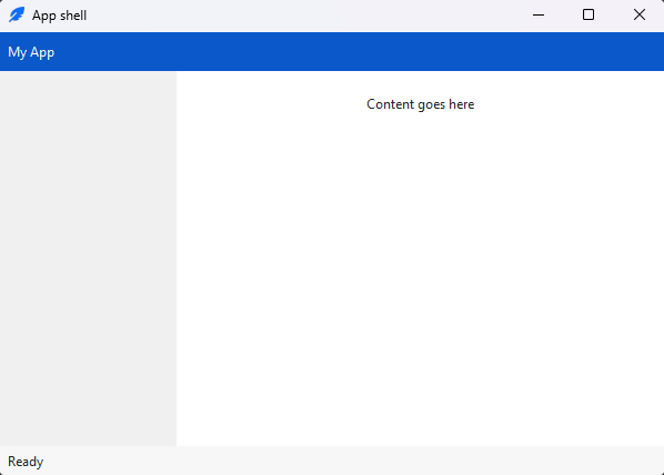
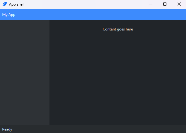
The header and status bars fill="x" against their edges; the middle frame
expand=True so it takes everything left; inside it the sidebar takes a
fixed-width slice on the left and the content expands into the rest.
pack_propagate(False) stops the sidebar from shrinking to its contents so its
width sticks.
One manager per container
Don’t mix pack and grid on children of the same parent — they
negotiate size differently and tkinter will hang trying to reconcile them.
Each container uses one manager; nesting frames (as above) is how you combine
them — a toolbar packed at the top, a form gridded inside the content area.
A note on place#
The third manager, place, positions a widget at an exact or relative
coordinate. You’ll rarely need it — reach for it only for overlays or a badge
pinned to a corner, where neither pack nor grid fits:
badge.place(relx=1.0, rely=0.0, anchor="ne") # pin to the top-right corner
See the Place reference.
Recap#
packstacks widgets against aside(topby default).fillstretches a widget within its reserved space;expandgrows that space to claim what’s left over — a growing region wants both.Combine managers by nesting frames, one manager per container.
See also
Layout with grid for the table-based manager you’ll use for forms and aligned content.