Button
A ttk.Button widget displays a textual string, bitmap or image. If text is displayed, it must all be in a single
font, but it can occupy multiple lines on the screen (if it contains newlines or if wrapping occurs because of the
wraplength option) and one of the characters may optionally be underlined using the underline option. It can
display itself in either of three different ways, according to the state option; it can be made to appear raised,
sunken, or flat; and it can be made to flash. When a user invokes the button (by pressing mouse button 1 with the
cursor over the button), then the command specified in the command option is invoked.
Note
This is a style guide for using ttkbootstrap styles. This guide will show you how to apply visual styles to change the look and feel of the widget. For more information on how to use the widget and what options are available, consult the reference section on widgets.
Overview
The ttk.Button includes the TButton, Outline.TButton, and Link.TButton style classes. The primary
color is applied to all buttons by default. Other styles must be specified with the style option. These styles are
further subclassed by each of the theme colors to produce the following color and style combinations:
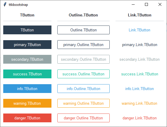
The Link.TButton has an info colored hover effect as well as a slight shiftrelief when the button is pressed.
How to use
The examples below demonstrate how to use a style when creating a widget. To learn more about how to use the widget in ttk, check out the References section for links to documentation and tutorials on this widget.
Create a default solid button
ttk.Button(parent, text='Submit')
Create a default outline button
ttk.Button(parent, text='Submit', style='Outline.TButton')
Create an ‘info’ solid button
ttk.Button(parent, text='Submit', style='info.TButton')
Create a ‘warning’ outline button
ttk.Button(parent, text="Submit", style='warning.Outline.TButton')
Style configuration
Use the following classes, states, and options when configuring or modifying a new ttk button style. See the python style documentation for more information on creating a style.
Create a new theme using TTK Creator if you want to change the default color scheme.
Class names
TButton
Outline.TButton
Link.TButton
Dynamic states
active
disabled
pressed
readonly
Style options
- anchor
e, w, center
- background
color
- bordercolor
color
- compound
top, bottom, left, right
- darkcolor
color
- embossed
amount
- focuscolor
color
- focusthickness
amount
- foreground
color
- font
font
- highlightcolor
color
- highlightthickness
amount
- justify
left, right, center
- lightcolor
color
- padding
padding
- relief
flat, groove, raised, ridge, solid, sunken
- shiftrelief
amount
- width
amount
Create a custom style
Change the font and font-size on all buttons
Style.configure('TButton', font=('Helvetica', 12))
Change the foreground color when the button is active
Style.map('TButton', foreground=[
    ('disabled', 'white'),
    ('active', 'yellow')])
Subclass an existing style to create a new one, using the pattern ‘newstyle.OldStyle’
Style.configure('custom.TButton', background='red', foreground='white', font=('Helvetica', 24))
Use a custom style
ttk.Button(parent, text='Submit', style='custom.TButton')