Scrollbar
ttk.Scrollbar widgets are typically linked to an associated window that displays a document of some sort, such as a
file being edited or a drawing. A scrollbar displays a thumb in the middle portion of the scrollbar, whose position and
size provides information about the portion of the document visible in the associated window. The thumb may be dragged
by the user to control the visible region. Depending on the theme, two or more arrow buttons may also be present; these
are used to scroll the visible region in discrete units.
Overview
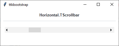
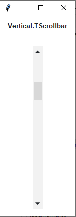
The ttk.Scrollbar includes the Horizontal.TScrollbar and Vertical.TScrollbar style classes. These styles
are applied by default to horizontal and vertical orientations. So there is no need to specify the styles unless
you decide to create a new custom style.
How to use
The examples below demonstrate how to use a style to create a widget. To learn more about how to use the widget in ttk, check out the References section for links to documentation and tutorials on this widget.
Create a default horizontal scrollbar
ttk.Scrollbar(parent, orient='horizontal')
Create a default vertical scrollbar
ttk.Scrollbar(parent, orient='vertical')
Configuration
Use the following classes, states, and options when configuring or modifying a new ttk scrollbar style. TTK Bootstrap uses an image layout for parts of this widget (the arrows), so styling options will not affect these elements. However, if you choose to create your own scrollbar layout and style, you may use whatever style options are available for your custom style. See the python style documentation for more information on creating a style.
Create a new theme using TTK Creator if you want to change the default color scheme.
Class names
Horizontal.TScrollbar
Vertical.TScrollbar
Dynamic states
active
disabled
Style options
- arrowcolor
color
- arrowsize
amount
- background
color
- bordercolor
color
- gripcount
amount
- groovewidth
amount
- relief
flat, groove, raised, ridge, solid, sunken
- troughborderwidth
amount
- troughcolor
color
- troughrelief
flat, groove, raised, ridge, solid, sunken
- width
amount
Create a custom style
Change the thickness and background of all scrollbars
Style.configure('TScrollbar', width=30, background='black')
Subclass an existing style to create a new one, using the pattern ‘newstyle.OldStyle’
Style.configure('custom.Horizontal.TScrollbar', background='black', troughcolor='white', arrowcolor='white')
Use a custom style
ttk.Scrollbar(parent, orient='horizontal', style='custom.Horizontal.TScrollbar')