Combobox
A ttk.Combobox widget is a combination of an Entry and a drop-down menu. In your application, you will see the usual
text entry area, with a downward-pointing arrow. When the user clicks on the arrow, a drop-down menu appears. If the
user clicks on one, that choice replaces the current contents of the entry. However, the user may still type text
directly into the entry (when it has focus), or edit the current text.
Overview
The ttk.Combobox includes the TCombobox class. The primary color is applied by default. This style is further
subclassed by each of the theme colors to produce the following color and style combinations.
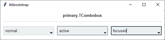
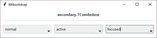
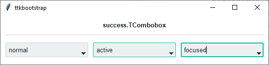
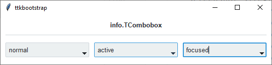
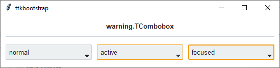
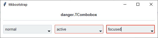
As you can see, in a normal state, all styles look the same. What distinguishes them are the colors that are used for the active and focused states.
How to use
The examples below demonstrate how to use a style to create a widget. To learn more about how to use the widget in ttk, check out the References section for links to documentation and tutorials on this widget.
Create a default combobox
cb = ttk.Combobox(parent)

for option in ['option 1', 'option 2', 'option 3']:
    cb.insert('end', option)
Create an ‘info’ combobox
ttk.Combobox(parent, style='info.TCombobox')
Style configuration
Use the following classes, states, and options when configuring or modifying a new ttk combobox style. See the python style documentation for more information on creating a style.
Create a new theme using TTK Creator if you want to change the default color scheme.
Class names
TCombobox
Dynamic states
disabled
focus
pressed
readonly
Style options
- anchor
e, w, center
- arrowcolor
color
- arrowsize
amount
- background
color
- bordercolor
color
- borderwidth
amount
- darkcolor
color
- fieldbackground
color
- foreground
color
- font
font
- lightcolor
color
- padding
padding
- relief
flat, groove, raised, ridge, solid, sunken
- width
amount
Note
The popdown list cannot be configured using the Style class. Instead, you must use the tk option database.
tk.option_add('*TCombobox*Listbox.background', color)tk.option_add('*TCombobox*Listbox.font', font)tk.option_add('*TCombobox*Listbox.foreground', color)tk.option_add('*TCombobox*Listbox.selectBackground', color)tk.option_add('*TCombobox*Listbox.selectForeground', color)
Create a custom style
Change the font and font-size on all comboboxes
Style.configure('TCombobox', font=('Helvetica', 12))
Change the arrow color when in different states
Style.map('TCombobox', arrowcolor=[
    ('disabled', 'gray'),
    ('pressed !disabled', 'blue'),
    ('focus !disabled', 'green'),
    ('hover !disabled', 'yellow')])
Subclass an existing style to create a new one, using the pattern ‘newstyle.OldStyle’
Style.configure('custom.TCombobox', background='green', foreground='white', font=('Helvetica', 24))
Use a custom style
ttk.Combobox(parent, style='custom.TCombobox')