Slider
A ttk.Scale widget is typically used to control the numeric value of a linked variable that varies uniformly over
some range. A scale displays a slider that can be moved along over a trough, with the relative position of the slider
over the trough indicating the value of the variable.
Overview
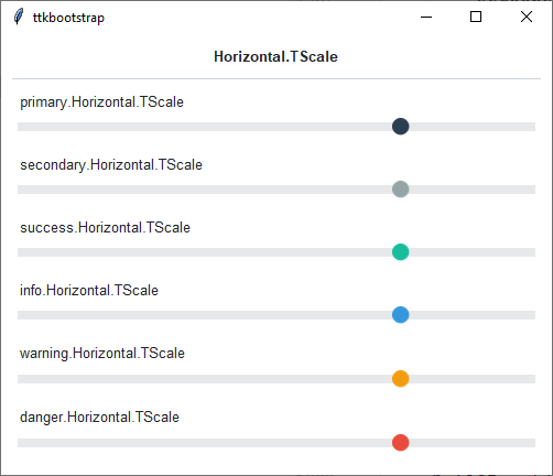
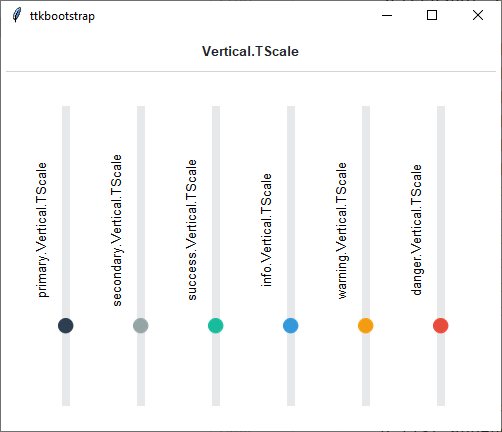
The ttk.Scale includes the Horizontal.TScale and Vertical.TScale style classes. These styles are further
subclassed by each of the theme colors to produce the following color and style combinations:
How to use
The examples below demonstrate how to use a style to create a widget. To learn more about how to use the widget in ttk, check out the References section for links to documentation and tutorials on this widget.
Create a default horizontal scale
ttk.Scale(parent, from_=0, to=100, value=75)
Create a default vertical scale
ttk.Scale(parent, from_=0, to=100, value=75, orient='vertical')
Configuration
Use the following classes, states, and options when configuring or modifying a new ttk progressbar style. TTK Bootstrap uses an image layout for this widget, so styling options will be limited, and not all options below will be available for ttk bootstrap themes. See the python style documentation for more information on creating a style.
Create a new theme using TTK Creator if you want to change the default color scheme.
Class names
Horizontal.TScale
Vertical.TScale
Dynamic states
Active
Style options
- background
color
- borderwidth
amount
- darkcolor
color
- groovewidth
amount
- lightcolor
color
- sliderwidth
amount
- troughcolor
color
- relief
flat, groove, raised, ridge, solid, sunken