Menubutton
A ttk.Menubutton widget displays a textual label and/or image, and displays a menu when pressed.
Overview
The ttk.Menubutton includes the TMenubutton and Outline.TMenubutton style classes. The TMenubutton style
is applied to all Menubuttons by default and uses the theme primary color as the background. These two primary styles
are further subclassed by each of the theme colors to produce the following color and style combinations:
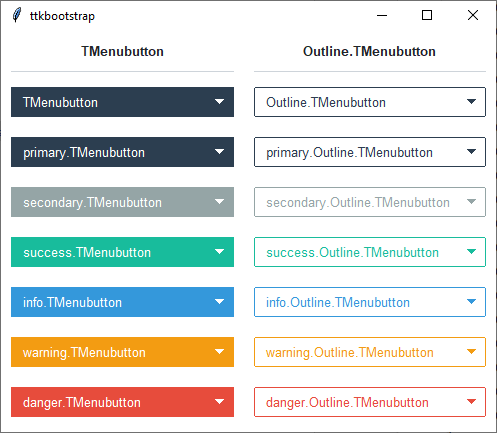
The Outline.TMenubutton style has a solid fill color (matching the regular TMenubutton) when hovered or pressed.
How to use
The examples below demonstrate how to use a style to create a widget. To learn more about how to use the widget in ttk, check out the References section for links to documentation and tutorials on this widget.
Create an info outline menubutton
mb = ttk.Menubutton(parent, text='My widgets', style='info.Outline.TMenubutton')

# create menu
menu = tk.Menu(mb)

# add options
option_var = tk.StringVar()
for option in ['option 1', 'option 2', 'option 3']:
    menu.add_radiobutton(label=option, value=option, variable=option_var)

# associate menu with menubutton
mb['menu'] = menu
Style configuration
Use the following classes, states, and options when configuring or modifying a new ttk menubutton style. See the python style documentation for more information on creating a style.
Create a new theme using TTK Creator if you want to change the default color scheme.
Class names
TMenubutton
Outline.TMenubutton
Dynamic states
active
disabled
readonly
Style options
- arrowsize
amount
- arrowcolor
color
- arrowpadding
amount
- background
color
- compound
top, bottom, left, right
- bordercolor
color
- borderwidth
amount
- darkcolor
color
- focusthickness
amount
- focuscolor
color
- foreground
color
- font
font
- lightcolor
color
- padding
padding
- relief
flat, groove, raised, ridge, solid, sunken
Create a custom style
Change the font and font-size on all menubuttons
Style.configure('TMenubutton', font=('Helvetica', 12))
Subclass an existing style to create a new one, using the pattern ‘newstyle.OldStyle’
Style.configure('custom.TMenubutton', background='red', foreground='white', font=('Helvetica', 24))
Use a custom style
ttk.Menubutton(parent, text='My widgets', style='custom.TMenubutton')
Note
The Menu object cannot be configured with Style. Instead, use the tk option database.
tk.option_add('*Menu.tearoff', 0)tk.option_add('*Menu.foreground', 'white')tk.option_add('*Menu.selectColor', 'blue')tk.option_add('*Menu.font', 'Helvetica 12')tk.option_add('*Menu.background', 'black')tk.option_add('*Menu.activeBackground', 'yellow')tk.option_add('*Menu.activeForegorund', 'blue')