Frame
A ttk.Frame widget is a container, used to group other widgets together.
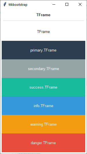
Overview
The ttk.Frame includes the TFrame class. This class is further subclassed by each of the theme colors to
produce the following color and style combinations. The TFrame style is applied to all frame widgets by default and
shares the same color as the theme background.
How to use
The examples below demonstrate how to use a style to create a widget. To learn more about how to use the widget in ttk, check out the References section for links to documentation and tutorials on this widget.
Create a default frame
ttk.Frame(parent)
Create an ‘info’ frame
ttk.Frame(parent, style='info.TFrame')
Style configuration
Use the following classes, states, and options when configuring or modifying a new ttk button style. See the python style documentation for more information on creating a style.
Create a new theme using TTK Creator if you want to change the default color scheme.
Class names
TFrame
Dynamic states
disabled
focus
pressed
readonly
Style options
- background
color
- relief
flat, groove, raised, ridge, solid, sunken
Create a custom style
Subclass an existing style to create a new one, using the pattern ‘newstyle.OldStyle’
Style.configure('custom.TFrame', background='green', relief='sunken')
Use a custom style
ttk.Frame(parent, style='custom.TFrame')
Tips & tricks
If you use a themed Frame widget, then you will likely want to use a Label widget with an Inverse.TLabel style. This will create the effect that is presented in the Overview, with the the label background matching the background color of its parent.
frm = ttk.Frame(parent, style='danger.TFrame')
lbl = ttk.Label(f, text='Hello world!', style='danger.Inverse.TLabel')