Calendar
The calendar module contains several classes and functions that enable the user to select a date.
Note
This is a style guide for using ttkbootstrap styles. This guide will show you how to apply visual styles to change the look and feel of the widget. For more information on how to use the widget and what options are available, consult the reference section on widgets.
Overview
The DateEntry and DateChooserPopup are the two classes that you will use along with the calendar.ask_date()
helper function.
The DateEntry widget is a ttk.Entry widget combined with a ttk.Button widget that opens up a
DateChooserPopup when pressed. It is recommended to not use the DateChooserPopup directly, unless you want to
subclass it, but rather to use it via the calendar.ask_date() method, which opens up a DateChooserPopup and
returns the selected value as a datetime object.
All of these objects have a style parameter that accept a TCalendar style. By default, the primary color is
applied to the widget. However, the base style is further subclassed by each of the theme colors to produce the
following color and style combinations for DateEntry and DateChooserPopup.
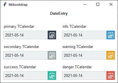
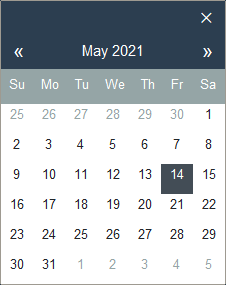
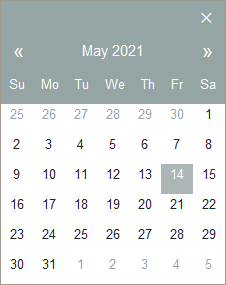
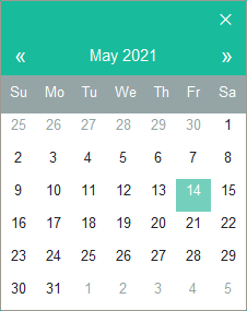
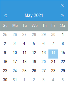
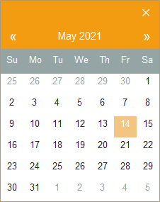
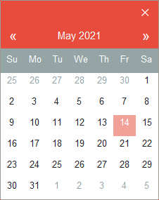
The styles above correspond to the same colored DateChooserPopup below:
How to use
The examples below demonstrate how to use a style when creating a calendar widget.
Create a default date entry
DateEntry(parent)
Create a success date entry
DateEntry(parent, style='success.TCalendar')
Create a button that calls the calendar popup by assigning a callback.
def callback():
    return ask_date()

btn = ttk.Button(parent, text='Get Date', command=callback)
Style configuration
Use the following classes, states, and options when configuring or modifying a new calendar style. Some options are only available in certain styles. See the python style documentation for more information on creating a style.
Create a new theme using TTK Creator if you want to change the default color scheme.
Class names
TCalendar
Dynamic states
active
alternate
disabled
pressed
selected
readonly
Style options
- background
color
- compound
compound
- foreground
foreground
- focuscolor
color
- focusthickness
amount
- font
font
- padding
padding
Create a custom style
Change the font and font-size on all calendar buttons
Style.configure('TCalendar', font=('helvetica', 12))
Change the foreground color when the calendar date is selected
Style.map('TCalendar', foreground=[
    ('disabled', 'white'),
    ('selected', 'yellow'),
    ('!selected', 'gray')])
Subclass an existing style to create a new one, using the pattern ‘newstyle.OldStyle’
Style.configure('custom.TCalendar', foreground='tan', font=('Helvetica', 10))
Use a custom style
DateEntry(parent, style='custom.TCalendar')