Progressbar
A ttk.Progressbar widget shows the status of a long-running operation. They can operate in two modes: determinate
mode shows the amount completed relative to the total amount of work to be done, and indeterminate mode provides an
animated display to let the user know that something is happening.
Overview
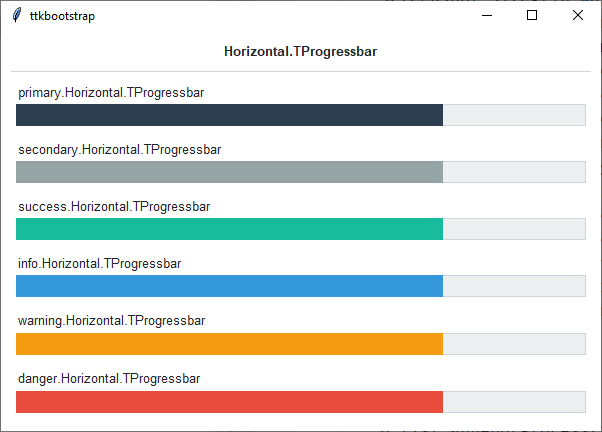
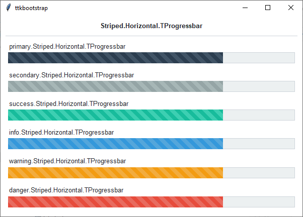
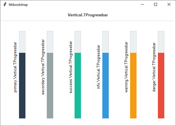
The ttk.Progressbar includes the Horizontal.TProgressbar, Vertical.TProgressbar, and
Striped.Horizontal.TProgressbar styles. These styles are further subclassed by each of the theme colors to produce
the following color and style combinations (the primary color is the default for all progress bars:
How to use
The examples below demonstrate how to use a style to create a widget. To learn more about how to use the widget in ttk, check out the References section for links to documentation and tutorials on this widget.
Create a default horizontal progressbar
ttk.Progressbar(parent, value=75)
Create a default vertical progressbar
ttk.Progressbar(parent, value=75, orient='vertical')
Create a default horizontal striped progressbar
ttk.Progressbar(parent, value=75, style='Striped.Horizontal.TProgressbar')
Create a success horizontal striped progressbar
ttk.Progressbar(parent, value=75, style='success.Striped.Horizontal.TProgressbar')
Configuration
Use the following classes, states, and options when configuring or modifying a new ttk progressbar style. The Striped.Horizontal.TProgressbar is an image-based layout, so the styling options will be limited to those which affect the trough. The regular progressbar styles can be configured with all available options. See the python style documentation for more information on creating a style.
Create a new theme using TTK Creator if you want to change the default color scheme.
Class names
Horizontal.TProgressbar
Vertical.TProgressbar
Striped.Horizontal.TProgressbar
Style options
- background
color
- barsize
amount
- bordercolor
color
- borderwidth
amount
- darkcolor
color
- lightcolor
color
- pbarrelief
flat, groove, raised, ridge, solid, sunken
- thickness
amount
- troughcolor
color
- troughrelief
flat, groove, raised, ridge, solid, sunken
Create a custom style
Change the thickness and relief of all progressbars
Style.configure('TProgressbar', thickness=20, pbarrelief='flat')
Subclass an existing style to create a new one, using the pattern ‘newstyle.OldStyle’
Style.configure('custom.Horizontal.TProgressbar', background='green', troughcolor='gray')
Use a custom style
ttk.Progressbar(parent, value=25, orient='horizontal', style='custom.Horizontal.TProgressbar')