Entry
The ttk.Entry widget displays a one-line text string and allows that string to be edited by the user. The value of
the string may be linked to a tkinter variable with the textvariable option. Entry widgets support horizontal
scrolling with the standard xscrollcommand option and xview widget command.
Overview
The ttk.Entry includes the TEntry class. The primary color is applied by default. This style is further
subclassed by each of the theme colors to produce the following color and style combinations.
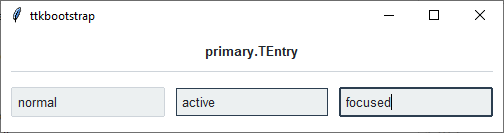
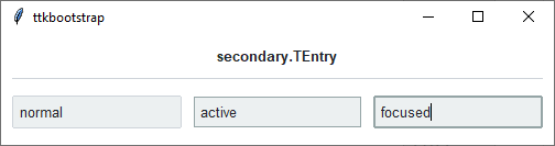
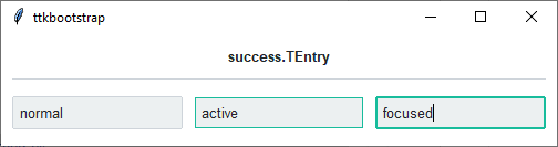
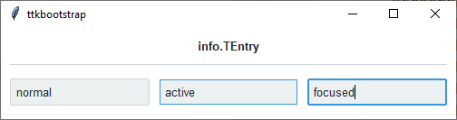
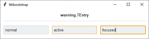
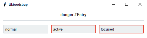
As you can see, in a normal state, all styles look the same. What distinguishes them are the colors that are used for the active and focused states.
How to use
The examples below demonstrate how to use a style to create a widget. To learn more about how to use the widget in ttk, check out the References section for links to documentation and tutorials on this widget.
Create a default entry
entry = ttk.Entry(parent)

entry.insert('Hello world!')
Create an ‘info’ entry
ttk.Entry(parent, style='info.TEntry')
Style configuration
Use the following classes, states, and options when configuring or modifying a new ttk.Entry style.
See the python style documentation for more information on creating a style.
Create a new theme using TTK Creator if you want to change the default color scheme.
Class names
TEntry
Dynamic states
disabled
focus
readonly
Style options
- background
color
- bordercolor
color
- borderwidth
amount
- darkcolor
color
- fieldbackground
color
- foreground
color
- font
font
- lightcolor
color
- padding
padding
- relief
flat, groove, raised, ridge, solid, sunken
- selectbackground
color
- selectborderwidth
amount
- selectforeground
color
Create a custom style
Change the font and font-size on all entry widgets
Style.configure('TEntry', font=('Helvetica', 12))
Change the foreground color when in different states
Style.map('TEntry', foreground=[
    ('disabled', 'gray'),
    ('focus !disabled', 'green'),
    ('hover !disabled', 'yellow')])
Subclass an existing style to create a new one, using the pattern ‘newstyle.OldStyle’
Style.configure('custom.TEntry', background='green', foreground='white', font=('Helvetica', 24))
Use a custom style
ttk.Entry(parent, style='custom.TEntry')