Treeview
The ttk.Treeview widget displays a hierarchical collection of items. Each item has a textual label, an optional
image, and an optional list of data values. The data values are displayed in successive columns after the tree label.
The order in which data values are displayed may be controlled by setting the displaycolumns widget option. The tree widget can also display column headings. Columns may be accessed by number or by symbolic names listed in the columns widget option.
Each item is identified by a unique name. The widget will generate item IDs if they are not supplied by the caller. There is a distinguished root item, named {}. The root item itself is not displayed; its children appear at the top level of the hierarchy.
Each item also has a list of tags, which can be used to associate event bindings with individual items and control the appearance of the item.
Treeview widgets support horizontal and vertical scrolling with the standard [xy]scrollcommand options and [xy]view widget commands.
Overview
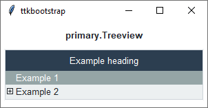
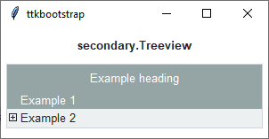
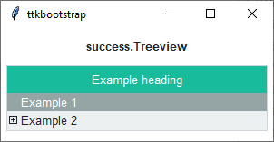
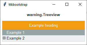
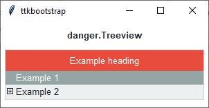
The ttk.Treeview includes the Treeview class. The primary color is applied to this widget by default. This
style is further subclassed by each of the theme colors to produce the following color and style combinations.
How to use
The examples below demonstrate how to use a style to create a widget. To learn more about how to use the widget in ttk, check out the References section for links to documentation and tutorials on this widget.
Create a default treeview
cb = ttk.Treeview(parent, columns=[1, 2, 3], show='headings')
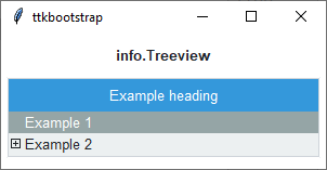
Create an ‘info’ treeview
ttk.Treeview(parent, columns=[1, 2, 3], show='headings', style='info.Treeview')
Configuration
Use the following classes, states, and options when configuring or modifying a new ttk separator style. See the python style documentation for more information on creating a style.
Create a new theme using TTK Creator if you want to change the default color scheme.
Class names
Treeview
Heading
Item
Cell
Dynamic states
disabled
selected
Style options
Treeview styling options include:
- background
color
- fieldbackground
color
- font
font
- foreground
color
- rowheight
amount
Heading styling options include:
- background
color
- font
font
- relief
relief
Item styling options include:
- foreground
color
- indicatormargins
padding
- indicatorsize
amount
- padding
padding
Cell styling options include:
- padding
padding