Sizegrip
A ttk.Sizegrip widget (also known as a grow box) allows the user to resize the containing toplevel window by
pressing and dragging the grip.
Overview
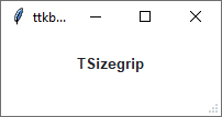
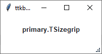
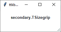
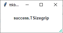
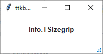
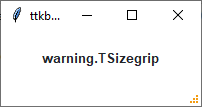
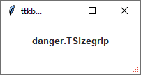
The ttk.Sizegrip includes the TSizegrip style class. By default, the color of the sizegrip is the border
color for light themes and the inputfg color for dark themes. This is further subclassed by each of the theme colors
to produce the following color and style combinations:
How to use
The examples below demonstrate how to use a style to create a widget. To learn more about how to use the widget in ttk, check out the References section for links to documentation and tutorials on this widget.
Create a default sizegrip
ttk.Sizegrip(parent)
Create a success sizegrip
ttk.Sizegrip(parent, style='success.TSizegrip')
Configuration
Use the following classes, states, and options when configuring or modifying a new ttk sizegrip style. TTK Bootstrap uses an image layout for this widget, so styling options will not be available for TTK Bootstrap themes. See the python style documentation for more information on creating a style.
Create a new theme using TTK Creator if you want to change the default color scheme.
Class names
TSizegrip
Style options
background color