Meter
The Meter is a custom ttkbootstrap widget that can be used to show progress of long-running operations or the
amount of work completed. It can also be used as a Dial when interactive mode is set to True.
Note
This is a style guide for using ttkbootstrap styles. This guide will show you how to apply visual styles to change the look and feel of the widget. For more information on how to use the widget and what options are available, consult the reference section on widgets.
Overview
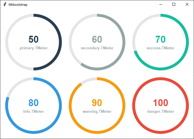
This widget is very flexible. The metertype parameter has two stock settings: full and semi, which shows a full
circle and a semi-circle respectively. Customize the arc of the circle with the arcrange and arcoffset
parameters. This moves the starting position of the arc and can also be used to make the arc longer or shorter.
The meter color is set with meterstyle and uses the TMeter style class. This also colors the center text. There is
an optional supplementary label below the center text that can be styled with the labelstyle parameter, which
excepts a TLabel style class. This setting also formats the text added with textappend and textprepend.
The primary.TMeter style is applied by default. The base style is further subclassed by each of the theme colors to produce the following color and style combinations:
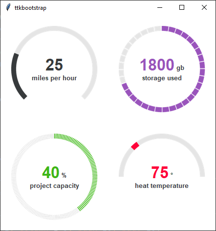
The examples below demonstrate how flexible this widget can be. You can see the code for these in the Cookbook.
How to use
The examples below demonstrate how to use a style when creating a meter widget.
Create a default meter
Meter(parent, amountused=25, labeltext='miles per hour')
Create a danger meter
Meter(parent, amountused=25, labeltext='miles per hour', meterstyle='danger.TLabel')
Create an info meter with an success label
Meter(parent, amountused=25, labeltext='miles per hour', meterstyle='info.TLabel', labelstyle='success.TLabel')