Spinbox
A ttk.Spinbox widget is a ttk.Entry widget with built-in up and down buttons that are used to either modify a
numeric value or to select among a set of values. The widget implements all the features of the ttk.Entry widget
including support of the textvariable option to link the value displayed by the widget to a tkinter variable.
Overview
The ttk.Spinbox includes the TSpinbox class. The primary color is applied to this widget by default. This style
is further subclassed by each of the theme colors to produce the following color and style combinations.
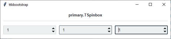
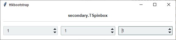
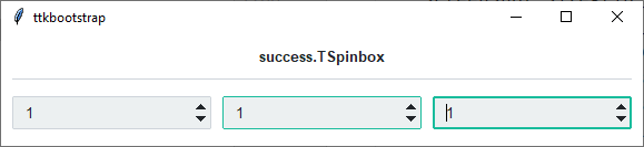
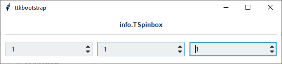
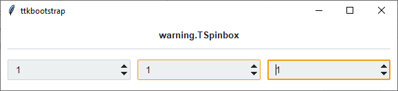
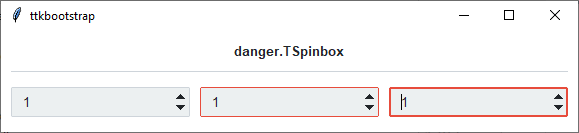
As you can see, in a normal state, all styles look the same. What distinguishes them are the colors that are used for the active and focused states.
How to use
The examples below demonstrate how to use a style to create a widget. To learn more about how to use the widget in ttk, check out the References section for links to documentation and tutorials on this widget.
Create a default spinbox
cb = ttk.Spinbox(parent, from_=1, to=100)
Create an ‘info’ spinbox
ttk.Spinbox(parent, from_=1, to=100, style='info.TSpinbox')
Configuration
Use the following classes, states, and options when configuring or modifying a new ttk spinbox style. Or, See the python style documentation for more information on creating a style.
create a new theme using TTK Creator if you want to change the default color scheme.
Class names
TSpinbox
Dynamic states
active
disabled
focus
readonly
Style options
- arrowcolor
color
- arrowsize
amount
- background
color (same as fieldbackground)
- bordercolor
color
- darkcolor
color
- fieldbackground
color
- foreground
color
- insertcolor
color
- insertwidth
amount
- lightcolor
color
- padding
padding
- selectbackground
color
- selectforeground
color
Create a custom style
Change the arrow color when in different states
Style.map('TSpinbox', arrowcolor=[
    ('disabled', 'gray'),
    ('pressed !disabled', 'blue'),
    ('focus !disabled', 'green'),
    ('hover !disabled', 'yellow')])
Subclass an existing style to create a new one, using the pattern ‘newstyle.OldStyle’
Style.configure('custom.TSpinbox', background='green', foreground='white', font=('Helvetica', 24))
Use a custom style
ttk.Spinbox(parent, style='custom.TSpinbox')