Checkbutton
A ttk.Checkbutton widget is used to show or change a setting. It has two states, selected and deselected. The state
of the checkbutton may be linked to a tkinter variable.
Overview
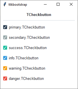
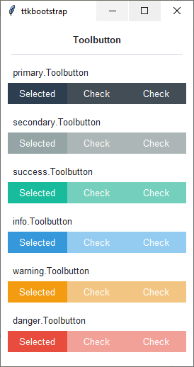
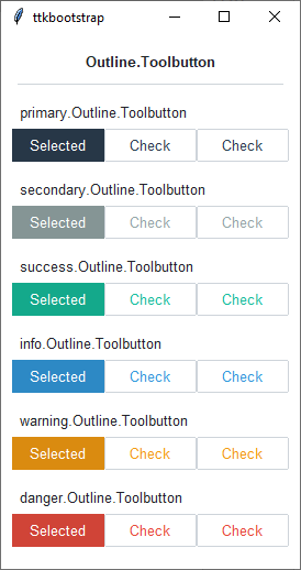
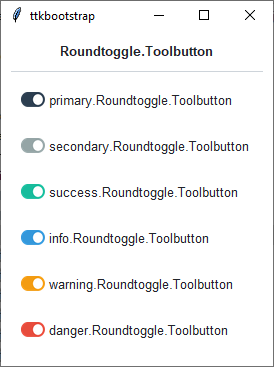
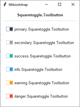
The ttk.Checkbutton includes the TCheckbutton, Toolbutton, Outline.Toolbutton,
Roundtoggle.Toolbutton, and Squaretoggle.Toolbutton style classes. The primary.TCheckbutton style is applied
to all checkbuttons by default. Other styles must be specified with the style option. These primary styles are
further subclassed by each of the theme colors to produce the following color and style combinations:
How to use
The examples below demonstrate how to use a style to create a widget. To learn more about how to use the widget in ttk, check out the References section for links to documentation and tutorials on this widget.
Create a default checkbutton
ttk.Checkbutton(parent, text='include', value=1)
Create a default toolbutton
ttk.Checkbutton(parent, text='include', style='Toolbutton')
Create a default outline toolbutton
ttk.Checkbutton(parent, text='include', style='Outline.Toolbutton')
Create a default round toggle toolbutton
ttk.Checkbutton(parent, text='include', style='Roundtoggle.Toolbutton')
Create a default square toggle toolbutton
ttk.Checkbutton(parent, text='include', style='Squaretoggle.Toolbutton')
Create an ‘info’ checkbutton
ttk.Checkbutton(parent, text='include', style='info.TCheckbutton')
Create a ‘warning’ outline toolbutton
ttk.Checkbutton(parent, text="include", style='warning.Outline.Toolbutton')
Style configuration
Use the following classes, states, and options when configuring or modifying a new ttk checkbutton style. TTK Bootstrap
uses an image layout for this widget, so not all of these options will be available… for example: indicatormargin.
However, if you decide to create a new widget, these should be available, depending on the style you are using as a
base. Some options are only available in certain styles. See the python style documentation for more information on
creating a style.
Create a new theme using TTK Creator if you want to change the default color scheme.
Class names
TCheckbutton
Toolbutton
Outline.Toolbutton
Roundtoggle.Toolbutton
Squaretoggle.Toolbutton
Dynamic states
active
alternate
disabled
pressed
selected
readonly
Style options
- background
color
- compound
compound
- foreground
foreground
- focuscolor
color
- focusthickness
amount
- font
font
- padding
padding
Create a custom style
Change the font and font-size on all checkbuttons
Style.configure('TCheckbutton', font=('Helvetica', 12))
Change the foreground color when the checkbutton is selected
Style.map('TCheckbutton', foreground=[
    ('disabled', 'white'),
    ('selected', 'yellow'),
    ('!selected', 'gray')])
Subclass an existing style to create a new one, using the pattern ‘newstyle.OldStyle’
Style.configure('custom.TCheckbutton', foreground='white', font=('Helvetica', 24))
Use a custom style
ttk.Checkbutton(parent, text='include', style='custom.TCheckbutton')