Labelframe
A ttk.Labelframe widget is a container used to group other widgets together. It has an optional label, which may be
a plain text string or another widget.
Overview
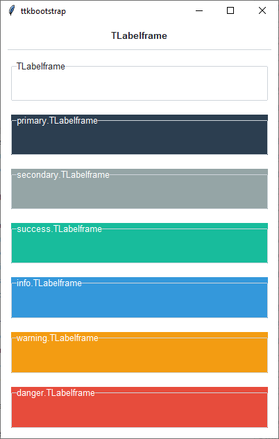
The ttk.Labelframe includes the TLabelframe style class. The TLabelframe style is applied to
all Labelframes by default and uses the theme border color for the frame and background color for the background.
Other styles must be specified with the style option. This style is further subclassed by each of the theme colors
to produce the following color and style combinations:
How to use
The examples below demonstrate how to use a style to create a widget. To learn more about how to use the widget in ttk, check out the References section for links to documentation and tutorials on this widget.
Create a default labelframe
ttk.Labelframe(parent, text='My widgets')
Create an ‘info’ labelframe
ttk.Labelframe(parent, text='My widgets', style='info.TLabelframe')
Style configuration
Use the following classes, states, and options when configuring or modifying a new ttk labelframe style. See the python style documentation for more information on creating a style.
Create a new theme using TTK Creator if you want to change the default color scheme.
Class names
TLabelframe
Dynamic states
disabled
readonly
Style options
- anchor
e, w, center
- background
color
- bordercolor
color
- borderwidth
amount
- darkcolor
color
- labelmargins
amount
- labeloutside
boolean
- lightcolor
color
- padding
padding
- relief
flat, groove, raised, ridge, solid, sunken
- width
amount
TLabelframe.Label styling options include:
- background
color
- darkcolor
color
- font
font
- foreground
color
- lightcolor
color