Separator
A ttk.Separator widget displays a horizontal or vertical separator bar.
Overview
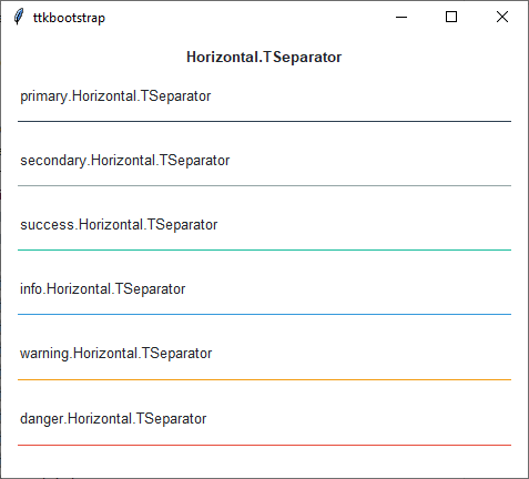
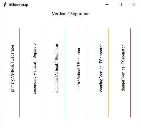
The ttk.Separator includes the Horizontal.TSeparator and Vertical.TSeparator style classes. These styles
are applied by default to horizontal and vertical orientations. These styles are further subclassed by each of the
theme colors to produce the following color and style combinations:
How to use
The examples below demonstrate how to use a style to create a widget. To learn more about how to use the widget in ttk, check out the References section for links to documentation and tutorials on this widget.
Create a default horizontal separator
ttk.Separator(parent, orient='horizontal')
Create a default vertical separator
ttk.Separator(parent, orient='vertical')
Create an info vertical separator
ttk.Separator(parent, orient='vertical', style='info.Vertical.TSeparator')
Configuration
Use the following classes, states, and options when configuring or modifying a new ttk separator style. TTK Bootstrap uses an image layout for this widget, so it is not possible to create a custom style without building a new layout. However, if you decide to build your own layout, you are free to use the styling options below. See the python style documentation for more information on creating a style.
Create a new theme using TTK Creator if you want to change the default color scheme.
Class names
Horizontal.TSeparator
Vertical.TSeparator
Style options
- background
color